Compare participants' medical histories
You can compare the medical histories or cancer journeys of a number of participants from your search results. These will appear in a graphical format.
From the results tab you can select the participants you want to compare using checkboxes. If you do not select any participants, you will compare either the first 12 medical histories or the first 20 cancer journeys. Select Compare then either medical history or cancer journey to go to the comparison.
Combined medical history timeline
The detailed comparison of multiple participants on a single timeline can be useful to detect phenotypic commonalities and differences between participants of interest. This compare view is limited to a maximum of 12 participants and when the combined number of data points for the selected participants does not exceed 32000.
The combined medical history timeline looks and behaves the same as the single participant timeline, with the following differences:
- Data series per participant instead of per data set; different colours represent different participants.
- Additional filter: Participant Shared Codes Threshold
- Additional setting: Alternate palette
- View by Participant Age is enabled by default
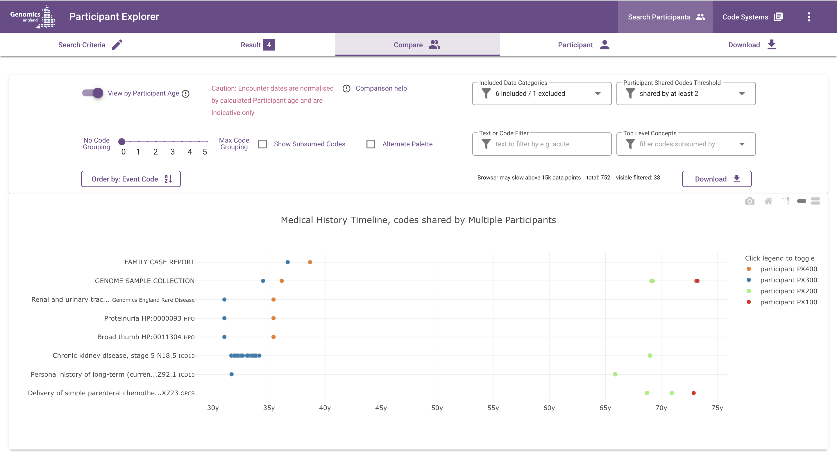
What does the chart show?
Each dot represents an event (such as a diagnosis, procedure or observation) in the participants' medical history. Different colours represent different participants.
Time is represented on the x-axis, by default labeled with approximate age (this can be changed to dates, using the "View by Participant Age" switch). Events are positioned at the start of the medical encounter they belong to; e.g. diagnoses made during an inpatient encounter are placed on the hospital admission date.
The vertical axis is used for event codes and descriptions and for grouping similar events together. By default, the displayed codes are the most specific codes available, i.e. the code with which the event is coded in the underlying data set. The code grouping slider, which is described in more detail below, can be used to "zoom out" from these detailed codes, by grouping related codes under their common ancestor codes according to the hierarchy in the applicable ontology or classification.
You can hover over each data point to see more details, such as the full code and description, date or age, stage details, source table and subsumed codes (if applicable).
Clicking on any data point opens the source table in Labkey in a new tab, filtered for that data point.
The combined timeline does not show stage values as text markers above data points, but will show stage values seperately as observation data points (if they pass the shared codes threshold and other filters).
The Timeline Help icon in the top-left will display a brief summary of the various timeline controls and filters available.
Legend and data series
Different data series represent different participants. By default, all participants are visible. You can click on a participant in the legend to hide that participant.
The Alternate palette option provides a different colour palette, which may be helpful for those affected by a colour vision deficiency.
Participant shared codes threshold
The Participant shared codes threshold filter controls the degree of commonality required for events to be visible on the timeline, by setting the minimum number of participants required to have a code for that code to be visible. By default, this is set to two, which means that a code must occur for at least two of the selected participants for that code to be visible.
A threshold of one participant means that all codes will be visible. The maximum setting is equal to the number of selected participants.
Importantly, the threshold is applied after the effect of the code grouping slider (to learn more about the code grouping slider, see the description here)
As a result, when increasing the level of code grouping, typically the number of data points that pass the shared codes threshold also increases. Example:
- Participant 1: diagnosed with ICD10 E66.9 Obesity, unspecified
- Participant 2: diagnosed with ICD10 E66.0 Obesity, due to excess calories
- Participant 3: diagnoses with ICD10 E67.0 Hypervitaminosis A
With the shared codes threshold set to two and code grouping set to zero (no grouping), the codes of these events are not shared and they will be hidden on the timeline.
With grouping set to three, E66.9 and E66.0 are grouped under the parent code E66 Obesity, which is now shared by the two participants and therefore the corresponding events will be shown in the timeline. Data points with code E67.0 will remain hidden.
With grouping set to four, E66 and E67 are grouped under the code block E65-E68 Obesity and other hyperalimentation. This means that the diagnosis of E67.0 for participant three is now also visible on the same row.
Vertical ordering
The "Order by" button toggles the vertical ordering of event codes between two options:
- Event code, ascending (default)
- Frequency, descending. Frequency is determined first by number of participants and then by total number of occurrences.
Other chart controls and filters
The following controls and filters are also available for the single participant timeline and function in the same way:
- Zoom and chart controls
- View by Participant Age switch
- Included Data Categories filter
- Text or Code filter
- Top Level Concepts filter
- Code Grouping slider
- Show Subsumed Codes
- Download
Please refer to the explanation for the single participant timeline here .
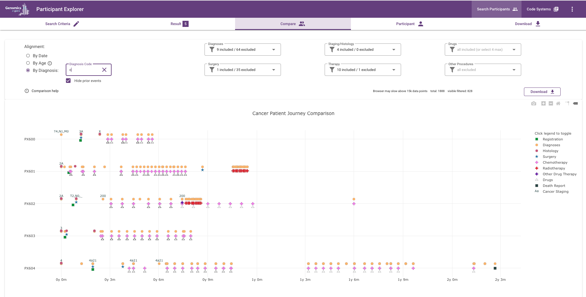
Cancer patient journey timeline
This view is designed to facilitate cancer patient journey comparison. Unlike the medical history timelines, not all the data available in Participant Explorer for the selected participants are available in this view e.g. HPO terms are not displayed. Rare Disease participants may also be viewed here but is likely to be a less rich experience than for cancer patients.
The term 'jitter' is used to describe the small vertical separation offset of traces on the timeline for a participant's data. For drug traces this jitter can be very small and referred to as 'micro jitter'.
The patient journey view shows:
- Pre-filtered participant data with multiple traces for different types of data 'jittered' from each other around a horizontal line per participant.
- three options for aligning the data in the time axis
- six pre-built filters some of which employ hierarchical code grouping to allow simpler selection of cancer concepts
What does the chart show?
Each dot represents an event (such as a diagnosis, procedure, observation or drug administration) in the participants' diagnostic and treatment journey. Different colours and shapes represent different types of diagnoses or treatments.
Time is represented on the x-axis and can either be the absolute date of the event or relative to each participant's calculated age or relative to the first occurrence of a selected diagnosis code.
The data points displayed on the timeline are always the most specific codes available matching the code selected in a filter, e.g. if the diagnosis C78 is selected, the events for codes C78.1, C78.2 etc. will be the ones plotted on the timeline (and counted in the filters).
You can hover over each data point to see more details, such as the full code and description, date or age, stage details and source table(s) grouped in the tooltip for all the events at that time point for an individual participant.
Stage values are visible as text markers above cancer diagnosis data points. If multiple stage values are available, the value with the highest display priority is shown: "Stage Best" > TNM Group/FIGO/Dukes > TNM components. All available values can be seen in the hover text.
The Comparison Help icon in the top-left will display a brief summary of the various timeline controls and filters available.
The chart can be re-scaled either by manually dragging a box on part of the chart or by the plot's default zoom in/out buttons (house icon resets the zoom).
Legend and data series
Different data series represent diagnoses or treatments, most of which are added from the filters (Registration,Sample Collection and Death Report data is displayed by default).
You can click on a description in the legend to hide that trace temporarily e.g. when individual drugs are selected, their separate traces are displayed in addition to the remaining unselected drugs which could then be removed from the display by selecting just the default 'Drugs' legend to leave only the user selected drugs.
Alignment controls
Alignment by Date: this is the default alignment where the original event dates are used for the data points.
Alignment by Age: calculates the participant's age at each event date and uses that as the x-axis value for each data point. The age is calculated from the year of birth, by taking January 1st as the date of birth, and is therefore only an approximation of the real age.
Alignment by Diagnosis: any ICD-10 or ICD-O-3 codes in the search criteria are used automatically to populate the Diagnosis code input box and then the first occurrence of any of those codes for each participant is used to calculate events relative to it. Alternatively, if this is not populated you can enter one or more ICD-10 or ICD-O-3 codes (separated by commas) to align by. The chart will start aligning on as little as one character if there are matching codes in the data (see screenshot above). Participants that do not have a matching code are removed from the display (irrespective of whether that code is selected in the Diagnosis/Histology filters).
Hide prior events: by default this checkbox is selected and hides data points that aligned as occurring before the alignment event date. De-selecting this option displays the events that occurred before the alignment date and the chart re-scales to include them.
Diagnosis, staging/histology, surgery, therapy and other procedures filters
These filters each list the occurrence of codes in the selected cohort of participants thus the content of the filters will vary with the cohort and may sometimes be empty.
The listed codes are sorted first by participant count then by data point count. Selection of a code moves it up to the top of it's sub-section in the filter above unselected codes with higher counts. De-selection reverts it to it's normal place in the sorting order.
The filters support 'type to search' and will narrow the list to matching text as expected. This has no effect on the codes actually selected.
For convenience, the filters group ICD-10, OPCS-4 and SNOMED codes according to their hierarchy, and descendant codes are included implicitly. In other words, subsumption logic applies. For example, selection of ICD-10 2-digit code C50 will show C50.1, C50.2 etc.
The filters combine codes from all available data sets (GLH, HES, NCRAS, SACT, ECDS etc.). See Data in the Participant Explorer for more details.
| Filter | Description | Default Selection | Notes |
|---|---|---|---|
| Diagnoses | Diagnosis codes (ICD-10 and SNOMED) | Cancer diagnoses | |
| Staging/Histology | Cancer Staging, Tumour morphology codes (ICD-O-3 and SNOMED) | All | |
| Surgery | Surgical procedure codes (NCRAS event codes, OPCS-4 and SNOMED) | NCRAS curative surgery events | Relevant OPCS-4 surgery codes should be manually selected |
| Therapy | Chemotherapy, Radiotherapy and other therapeutical procedure codes (NCRAS event codes, OPCS-4 and SNOMED) | All NCRAS event codes plus chemotherapy and radiotherapy codes from OPCS-4 and SNOMED | The chart uses separate colours for radiotherapy, chemotherapy, "other drug" therapy and "other" therapy codes. |
| Other Procedures | All procedure codes not included in the surgery or therapy filters, such as imaging and diagnostic tests. | None |
Drugs filter
The drugs filter operates differently to the other filters but, in common with them, it also displays a count of the number of participants and data points for each drug. It operates in an 'on by default' model whereby all the drug administration events are drawn on the chart as empty triangles even though none are selected.
When drugs are selected, for each of the first four selections, the data points for that drug are drawn as a differently coloured trace of solid coloured triangles which is micro jittered from the default drugs trace. Up to four drugs can be selected in this way with any remaining drug data points not selected staying on the chart as default empty triangles.
If you wish to remove the default drug trace temporarily you can click the 'Drug' entry in the legend.
Download
Click on the Download button to download the data points on the timeline as a TSV file.
Filters also restrict the data points included in the download (including the "prior events" filter when aligning by diagnosis)
Zooming and toggling data series by clicking in the legend do not affect the contents of the download.
For column details please refer to the Download section in the single participant timeline.
Other chart controls
The icons in the top-right corner of the chart area have the following functions, from left to right:
- Camera: Download a snapshot of the chart in PNG format
- Zoom in: zoom in in preset steps.
- Zoom out: zoom out preset steps. Note that the chart starts to drop participant id labels from the y axis after a couple of steps, however, the data points remain on the chart.
- Home: reset axes (reset the zoom-level)
- Toggle Spike Lines: enable vertical and horizontal lines when hovering over data points
- Show closest data on hover: display details of a single data point when hovering (enabled by default)
To zoom in on a specific area of interest, left-click and select a rectangular area inside the chart.